Hospitality Brand Future State UX Roadmap
Roadmapping the future state of a leading hospitality brand’s internal content management system.
My role
Led UX design as the sole UX designer on the project
Total team members: 5
Team roles: One delivery lead, one content expert, one backend expert, one information architect, and one UX designer (me!)
Challenge
Our client, one of the world’s leading hospitality brands, is looking to do an overhaul of their current content management system that houses all of their brand standards. A brand standard can be anything from the type of sheets to use on a bed, to how many restaurants should be on site at the property.
With a team of experts from several disciplines (content, functionality, UX) we conducted current state analysis, gathered future state requirements, and put together a roadmap for what the future state of our client’s CMS should look like.
Current State Analysis
Our first task was to take a look at the current state of our client’s brand standards website. Each of our team members spent several hours going through the site and taking notes on our area of expertise.
After spending some time familiarizing ourselves with the current system and some of the more obvious flaws, we built and conducted our first workshop with the client’s brand standards team, who arguably spends the most time using the system.
Some of our key current state takeaways from a UX standpoint were:
UI is overall clunky, outdated and unappealing
It takes too many steps for users to get the information they need
Making a change to a standard requires the use of multiple applications and there is no easy way to track status
No ability to compare standards between sub-brands
Personas
During our current state evaluation workshop, I created an activity for the brand standards team to create a set of user personas. During the workshop, they were also asked to prioritize these personas and think of personal “wish lists” for each user. Here are the final five personas we created as a team, after consolidation and edits from information we continued to gather over the course of the project.
*AD&C = Architecture, Design & Construction
**Note: Some words are hidden for client confidentiality purposes


User flows
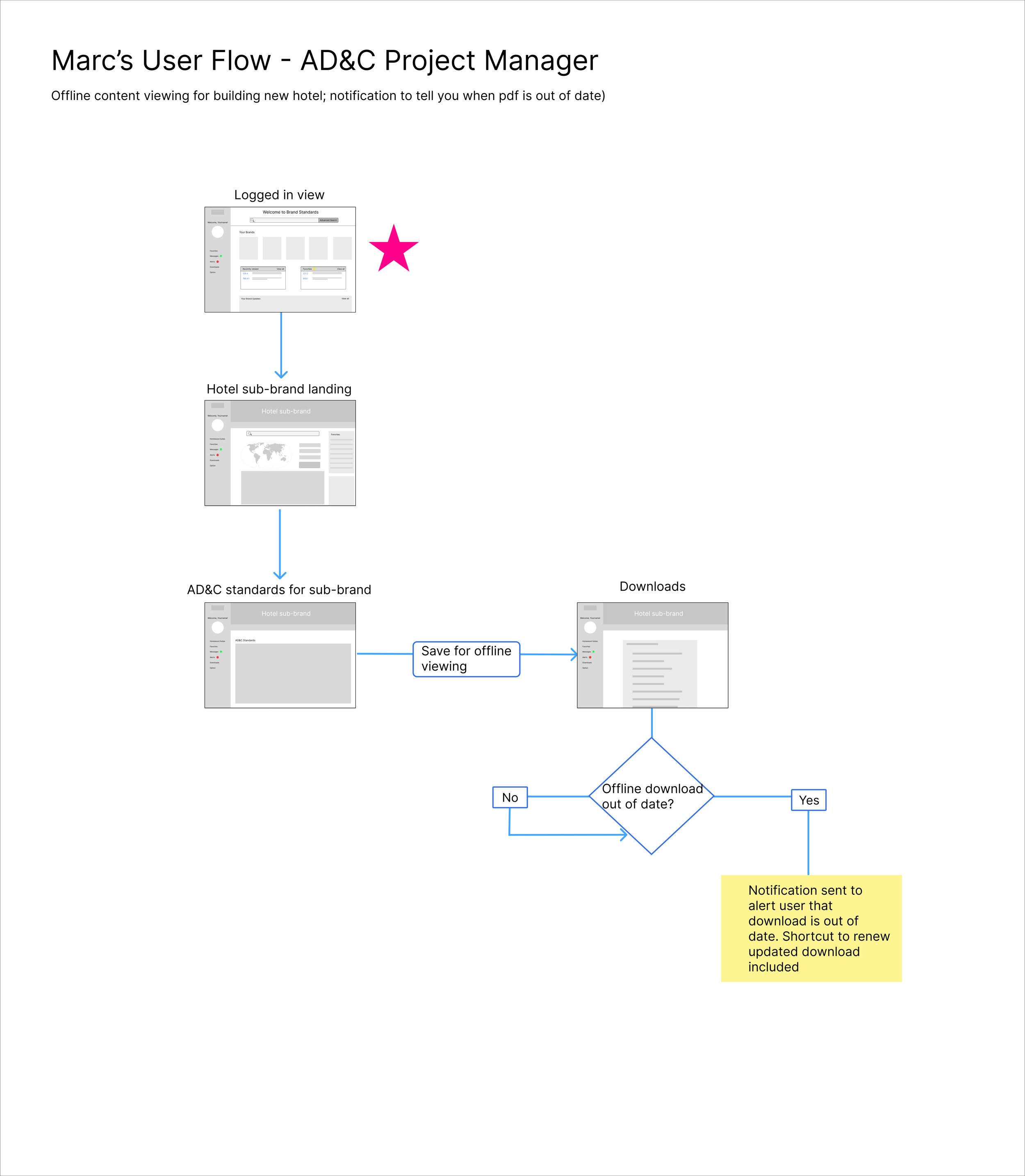
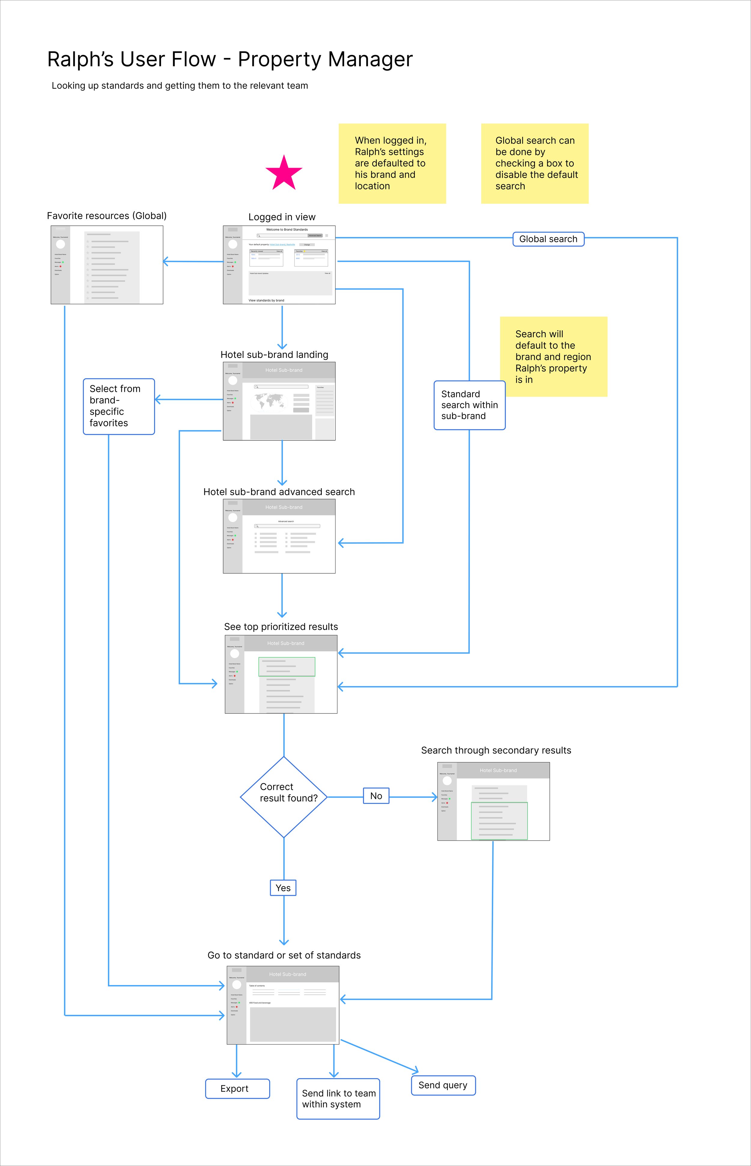
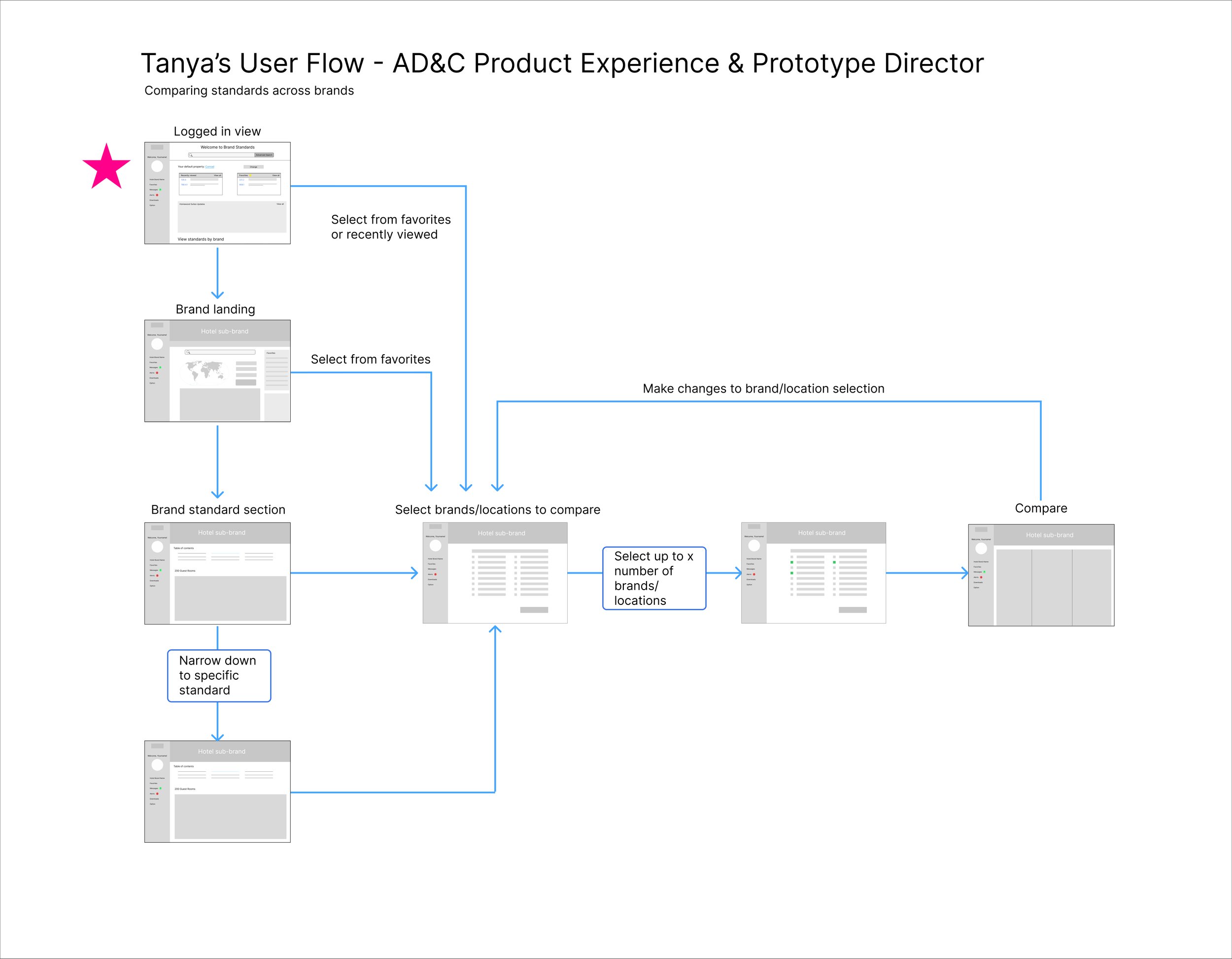
My final deliverable for this project, other than the personas, was to create a user flow for each persona. These user flows represent what our client described as the most important user path for each persona for us to outline in this early stage.


Wireframes and final mockups
As an extra addition to our originally scoped work, our team delivered two mockups to give stakeholders a glimpse into what their future brand standards platform might really look like. While I created the original wireframes to outline a rough idea of what the landing and standards pages might look like, the team pulled in a visual designer to take my wireframes and notes and create high-fidelity mockups after I had rolled off of the project.
*Note: Some elements are hidden for client confidentiality purposes
My version of the wireframes, which I was solely responsible for
Final comps with visual design
Lessons learned
The biggest challenge for all of our team members was the length of the project. This project was considered to be quite short for the amount of work we were doing, which sometimes required us to work long nights or even weekends.
As the UX lead for this project, this truly gave me more confidence in my ability to make design decisions. However, UX design is most often best done in collaboration with other designers, so sometimes it would have been nice to have another designer to brainstorm with and get feedback from.
